The Tricky Art of Sticky Positioning
Making Elements Stick to the Center While Preserving Document Flow
We started to get into scroll driven animations where we would have a sticky section that sticks to the middle of the screen when you're scrolling down the page. Then as you continue scrolling the section stays put but the content inside is manipulated by the scroll.
Sticking to the middle of the screen
This problem is not actually too hard to solve. Most people will show you the top: 50% and transform: translateY(-50%) trick.
top: 50%- When you set this element asposition: stickyyou need to specify absolute coordinates that tell it when to stick.50%will sticky the top of the element when it hits the middle of the screen.transform: translateY(-50%)- Sticking the top of the element to the middle isn't quite what we're going for, so this trick will translate the element up half of it's height so that it is now centered.
This is a great trick, and it works...sort of.
Oops, overlapping content!
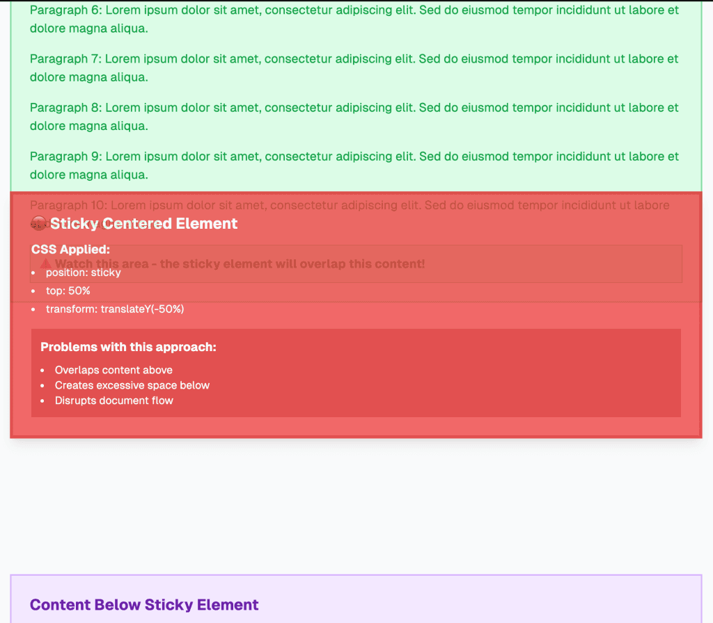
If you look at the above example, the sticky element is now overlapping the element above it by 50% of it's height. This is a side effect of the transform: translateY(-50%) which moves it out of the normal flow of the document.
Ok then, we need 50% more margin at the top
Seems like a simple solution. Just need to add some margin-top to our sticky element that is 50% of it's own height. Let's go ahead and try that.
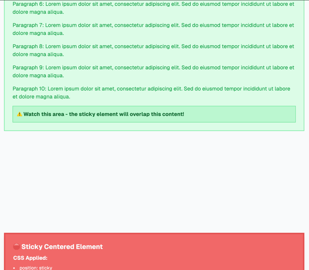
Um, what? That didn't work.
It takes a little digging to realize that 50% as margin-top actually means make margin-top 50% of the width of the element. What!?
This is from MDN:
The size of the margin as a percentage, relative to the inline size (width in a horizontal language, defined by
writing-mode) of the containing block.
Ok so that won't work.
Height - can't quite nail you down with CSS
I'm still not totally convinced there isn't a better way to do this, but from my research it appears there is on good way to use height for the margin property.
So we have to use JavaScript. Not the end of the world.
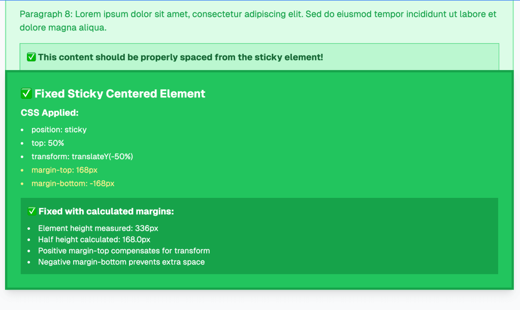
Measure
We need to measure the height of the element so we can set the margin-top and margin-bottom based on half of the height.
To do that we're going to use a resizeObserver to account for the fact this element could change size which means we need to recalculate.
I'm also using a helper hook called useResizeObserver to make this easier in React.
The wrapperRef is just referring to our sticky element. border-box is being specified because we need to match our CSS reset which sets all elements to border-box (the only sane choice). Some day need to refactor that useResizeObserver to default it to border-box.
Then we give it the function to run when this element resizes. It's giving us the size in the parameter so we can just assign that to a state variable that we'll use below.
Give me half
Then we can use that state variable on the margin style properties of our element.
Because we're using TypeScript we first check if the wrapperHeight is truthy. Then we take wrapperHeight and divide it by 2 and make it pixels.
We're adding margin to the top to make space for the above section but we need to do the opposite below. To this we turn to the beauty of negative margins. This will suck up the below content to the appropriate position.
Now we're talking!
Bonus - How long does it stick?
As part of the component I was building I added a prop called scrollSpeed. All it does it set the height of the wrapping element of our sticky element. The wrapping element is set to position: relative which means the sticky element will stick or not based on the positioning of this element relative to the scroll.
For instance, if we have an accordion that opens and closes based on scroll, we can control how much you need to scroll to open each accordion panel using this scrollSpeed prop.